Clustering In Practice#
…featuring \(k\)-means
Today we’ll do an extended example showing \(k\)-means clustering in practice and in the context of the python libraries
scikit-learn.
scikit-learn is the main python library for machine learning functions.
Our goals are to learn:
How clustering is used in practice
Tools for evaluating the quality of a clustering
Tools for assigning meaning or labels to a cluster
Important visualizations
A little bit about feature extraction for text
Training wheels: Synthetic data#
Generally, when learning about or developing a new unsupervised method, it’s a good idea to try it out on a dataset in which you already know the “right” answer.
One way to do that is to generate synthetic data that has some known properties.
Among other things, scikit-learn contains tools for generating synthetic data for testing.
import sklearn.datasets as sk_data
X, y = sk_data.make_blobs(n_samples=100, centers=3, n_features=30,
                          center_box=(-10.0, 10.0), random_state=0)
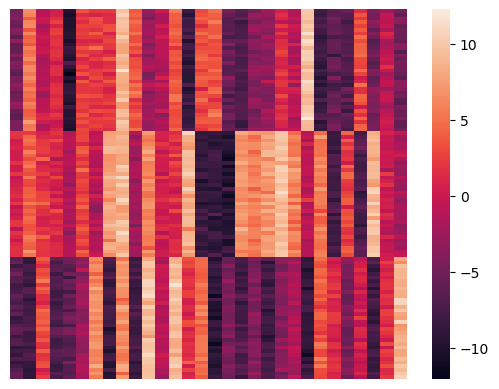
To get a sense of the raw data we can inspect it.
For statistical visualization, a good library is seaborn, imported as sns.
import seaborn as sns
sns.heatmap(X, xticklabels = False, yticklabels = False, linewidths = 0, cbar = False);
That plot shows all the data.
As usual, each row is a data item and the columns correspond to features (which are simply coordinates here).
Geometrically, these points live in a 30 dimensional space, so we cannot directly visualize their geometry.
This is a big problem that you will run into time and again!
We will discuss methods for visualizing high dimensional data later on.
For now, we will use a method that can turn a set of pairwise distances into an approximate 2-D representation in some cases.
So let’s compute the pairwise distances for visualization purposes.
We can compute all pairwise distances in a single step using a scikit-learn function:
import sklearn.metrics as metrics
euclidean_dists = metrics.euclidean_distances(X)
euclidean_dists
array([[ 0.        , 47.73797008, 45.18787978, ..., 47.87535624,
        49.64694402, 45.58307694],
       [47.73797008,  0.        , 43.66760596, ...,  7.3768511 ,
         7.36794305, 43.51069074],
       [45.18787978, 43.66760596,  0.        , ..., 42.55609472,
        43.80829605,  9.31642449],
       ...,
       [47.87535624,  7.3768511 , 42.55609472, ...,  0.        ,
         8.19377462, 41.81523421],
       [49.64694402,  7.36794305, 43.80829605, ...,  8.19377462,
         0.        , 43.41205895],
       [45.58307694, 43.51069074,  9.31642449, ..., 41.81523421,
        43.41205895,  0.        ]])
Visualizing with Multidimensional Scaling#
The idea behind Multidimensional Scaling (MDS) is:
given a distance (or dissimilarity) matrix,
find a set of coordinates for the points that approximates those distances as well as possible.
Usually we are looking for points in 2D or maybe 3D for visualization purposes.
The algorithm works using an algorithm that starts with random positions, and then moves points in a way that reduces the disparity between true distance and euclidean distance.
Note that there are many ways that this can fail!
Perhaps the dissimilarities are not well modeled as euclidean distances
It may be necessary to use more than 2 dimensions to capture any clustering via euclidean distances
Show code cell source
import sklearn.manifold
import matplotlib.pyplot as plt
mds = sklearn.manifold.MDS(n_components=2, max_iter=3000, eps=1e-9, random_state=0,
                   dissimilarity = "precomputed", n_jobs = 1)
fit = mds.fit(euclidean_dists)
pos = fit.embedding_
plt.scatter(pos[:, 0], pos[:, 1], s=8)
plt.axis('square');
/Users/crovella/miniconda3/lib/python3.9/site-packages/sklearn/manifold/_mds.py:299: FutureWarning: The default value of `normalized_stress` will change to `'auto'` in version 1.4. To suppress this warning, manually set the value of `normalized_stress`.
  warnings.warn(
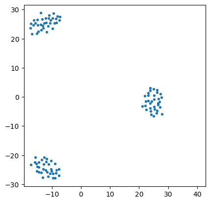
So we can see that, although the data lives in 30 dimensions, we can get a sense of how the points are clustered by approximately placing the points into two dimensions.
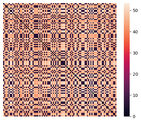
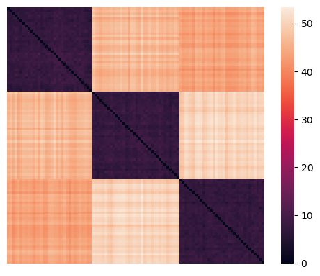
A second way to visualize the data is by using a heatmap on the set of pairwise distances.
sns.heatmap(euclidean_dists, xticklabels=False, yticklabels=False, linewidths=0,
            square=True );
Applying \(k\)-Means#
The Python package scikit-learn has a huge set of tools for unsupervised learning generally, and clustering specifically.
These are in sklearn.cluster.
There are 3 functions in all the clustering classes,
fit(),predict(), andfit_predict().
fit() builds the model from the training data (e.g. for \(k\)-means, it finds the
centroids),
predict() assigns labels to the data after building
the model, and
fit_predict() does both in a single step.
from sklearn.cluster import KMeans
kmeans = KMeans(init = 'k-means++', n_clusters = 3, n_init = 100)
kmeans.fit_predict(X)
array([1, 2, 0, 0, 2, 1, 2, 2, 1, 2, 0, 1, 0, 1, 2, 0, 0, 1, 0, 2, 0, 2,
       0, 1, 2, 2, 1, 0, 0, 0, 0, 1, 0, 1, 0, 2, 0, 2, 0, 2, 2, 2, 1, 0,
       1, 0, 1, 2, 1, 0, 0, 1, 1, 1, 1, 0, 1, 2, 2, 0, 1, 0, 2, 1, 1, 2,
       0, 1, 1, 2, 2, 2, 1, 1, 0, 1, 2, 1, 2, 1, 2, 2, 2, 1, 0, 0, 2, 1,
       1, 0, 1, 2, 2, 0, 1, 0, 0, 2, 2, 0], dtype=int32)
All the tools in scikit-learn are implemented as python objects.
Thus, the general sequence for using a tool from scikit-learn is:
Create the object, probably with some hyperparameter settings or intialization,
Run the method, generally by using the
fit()function, andExamine the results, which are generally property variables of the object.
centroids = kmeans.cluster_centers_
labels = kmeans.labels_
error = kmeans.inertia_
print(f'The total error of the clustering is: {error:0.1f}.')
print('\nCluster labels:')
print(labels)
print('\nCluster centroids:')
print(centroids)
The total error of the clustering is: 2733.8.

Cluster labels:
[1 2 0 0 2 1 2 2 1 2 0 1 0 1 2 0 0 1 0 2 0 2 0 1 2 2 1 0 0 0 0 1 0 1 0 2 0
 2 0 2 2 2 1 0 1 0 1 2 1 0 0 1 1 1 1 0 1 2 2 0 1 0 2 1 1 2 0 1 1 2 2 2 1 1
 0 1 2 1 2 1 2 2 2 1 0 0 2 1 1 0 1 2 2 0 1 0 0 2 2 0]

Cluster centroids:
[[-4.7833887   5.32946939 -0.87141823  1.38900567 -9.59956915  2.35207348
   2.22988468  2.03394692  8.9797878   3.67857655 -2.67618716 -1.17595897
   3.76433199 -8.46317271  3.28114395  3.73803392 -5.73436869 -7.0844462
  -3.75643598 -3.07904369  1.36974653 -0.95918462  9.91135428 -8.17722281
  -5.8656831  -6.76869078  3.12196673 -4.85745245 -0.70449349 -4.94582258]
 [ 0.88697885  4.29142902  1.93200132  1.10877989 -1.55994342  2.80616392
  -1.11495818  7.74595341  8.92512875 -2.29656298  6.09588722  0.47062896
   1.36408008  8.63168509 -8.54512921 -8.59161818 -9.64308952  6.92270491
   5.65321496  7.29061444  9.58822315  5.79602014 -0.84970449  5.46127493
  -7.77730238  2.75092191 -7.17026663  9.07475984  0.04245798 -1.98719465]
 [-7.0489904  -7.92501873  2.89710462 -7.17088692 -6.01151677 -2.66405834
   6.43970052 -8.20341647  6.54146052 -7.92978843  9.56983319 -0.86327902
   9.25897119  1.73061823  4.84528928 -9.26418246 -4.54021612 -7.47784575
  -4.15060719 -7.85665458 -3.76688414 -1.6692291  -8.78048843  3.78904162
   1.24247168 -4.73618733  0.27327032 -7.93180624  1.59974866  8.78601576]]
Visualizing the Results of Clustering#
Let’s visualize the results. We’ll do that by reordering the data items according to their cluster.
Show code cell source
import numpy as np
idx = np.argsort(labels)
rX = X[idx, :]
sns.heatmap(rX, xticklabels = False, yticklabels = False, linewidths = 0);
Show code cell source
rearranged_dists = euclidean_dists[idx,:][:,idx]
sns.heatmap(rearranged_dists, xticklabels = False, yticklabels = False, linewidths = 0, square = True);
Cluster Evaluation#
How do we know whether the clusters we get represent “real” structure in our data?
Consider this dataset, which we have clustered using \(k\)-means:
Show code cell source
import pandas as pd
unif_X = np.random.default_rng().uniform(0, 1, 100)
unif_Y = np.random.default_rng().uniform(0, 1, 100)
df = pd.DataFrame(np.column_stack([unif_X, unif_Y]), columns = ['X', 'Y'])
kmeans = KMeans(init = 'k-means++', n_clusters = 3, n_init = 100)
df['label'] = kmeans.fit_predict(df[['X', 'Y']])
df.plot('X', 'Y', kind = 'scatter', c = 'label', colormap='viridis', colorbar = False)
plt.axis('equal')
plt.axis('off');
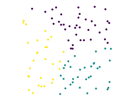
In fact, this dataset was generated using uniform random numbers for the coordinates.
So … it truly has no clusters.
The point is: any clustering algorithm will always output some “clustering” of the data.
The question is, does the clustering reflect real structure?
Generally we encounter two problems:
Are there “real” clusters in the data?
if so, how many clusters are there?
There is often no definitive answer to either of these questions.
You will often need to use your judgment in answering them.
Rand Index#
One tool we may be able to use in some settings is external information about the data.
In particular, we may have knowledge from some other source about the nature of the clusters in the data.
In that case, what we need is a way to compare a proposed clustering with some externally-known, “ground truth” clustering.
The Rand Index is a similarity measure for clusterings. We can use it to compare two clusterings.
Or, if we are testing an algorithm on data for which we know ground truth, we can use it to assess the algorithm’s accuracy.
Defining the Rand Index.
Each item in our dataset is assumed to have two labelings, one for each clustering.
For example, we could have a ground truth label assignment \(T\) and a comparison clustering \(C\).
Show code cell source
X_rand, y_rand = sk_data.make_blobs(n_samples=[100, 250, 150], centers = [[1, 2],[1.5, 3], [2, 4]], n_features = 2,
                          center_box = (-10.0, 10.0), cluster_std = [.2, .3, .2], random_state = 0)
df_rand_gt = pd.DataFrame(np.column_stack([X_rand[:, 0], X_rand[:, 1], y_rand]), columns = ['X', 'Y', 'label'])
df_rand_clust = df_rand_gt.copy()
kmeans = KMeans(init = 'k-means++', n_clusters = 3, n_init = 100)
df_rand_clust['label'] = kmeans.fit_predict(df_rand_gt[['X', 'Y']])
Show code cell source
figs, axs = plt.subplots(1, 2, figsize = (12, 5))
df_rand_gt.plot('X', 'Y', kind = 'scatter', c = 'label', colormap='viridis', ax = axs[0],
                   colorbar = False)
axs[0].set_title('Ground Truth (T)')
axs[0].set_axis_off()
df_rand_clust.plot('X', 'Y', kind = 'scatter', c = 'label', colormap='viridis', ax = axs[1],
                  colorbar = False)
axs[1].set_title('Clustering (C)')
axs[1].set_axis_off();
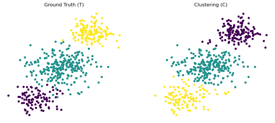
Intuitively, the idea behind Rand Index is to consider pairs of points, and ask whether pairs that fall into the same cluster in \(T\) also fall into the same cluster in \(C\).
Specifically:
Let \(a\) be the number of pairs that have the same label in \(T\) and the same label in \(C\).
Let \(b\) be: the number of pairs that have different labels in \(T\) and different labels in \(C\).
Then the Rand Index is: $\( \mbox{RI}(T,C) = \frac{a+b}{n \choose 2} \)$
How do we know whether a particular Rand Index (RI) score is significant?
We might compare it to the RI for a random assignment of points to labels.
This leads to the Adjusted Rand Index.
Definition of Adjusted Rand Index.
To “calibrate” the Rand Index this way, we use the expected Rand Index of random labelings, denoted \(E[\text{RI}]\).
The Expected Rand Index considers \(C\) to be a clustering that has the same cluster sizes as \(T\), but labels are assigned at random.
Using that, we define the adjusted Rand index as a simple rescaling of RI:
The computation of the \(E[\text{RI}]\) and the \(\max(\text{RI})\) are simple combinatorics (we’ll omit the derivation).
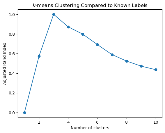
Example.
Let’s consider again our 3-cluster dataset with known labels y.
sns.heatmap(rX, xticklabels = False, yticklabels = False, linewidths = 0);
Here is the adjusted Rand Index, when using \(k\)-means to cluster this dataset for 1 to 10 clusters:
Show code cell source
def ri_evaluate_clusters(X,max_clusters,ground_truth):
    ri = np.zeros(max_clusters+1)
    ri[0] = 0;
    for k in range(1,max_clusters+1):
        kmeans = KMeans(init='k-means++', n_clusters=k, n_init=10)
        kmeans.fit_predict(X)
        ri[k] = metrics.adjusted_rand_score(kmeans.labels_,ground_truth)
    return ri

ri = ri_evaluate_clusters(X, 10, y)
plt.plot(range(1,len(ri)), ri[1:], 'o-')
plt.xlabel('Number of clusters')
plt.title('$k$-means Clustering Compared to Known Labels')
plt.ylabel('Adjusted Rand Index');
Deciding on the Number of Clusters#
The second question we face in evaluating a clustering is how many clusters are present.
In practice, to use \(k\)-means or most other clustering methods, one must choose \(k\), the number of clusters, via some process.
Inspecting Clustering Error#
The first thing you might do is to look at the \(k\)-means objective function and see if it levels off after a certain point.
Recall that the \(k\)-means objective can be considered the clustering “error”.
If the error stops going down, that would suggest that the clustering is not improving as the number of clusters is increased.
Show code cell source
error = np.zeros(11)
for k in range(1,11):
    kmeans = KMeans(init='k-means++', n_clusters = k, n_init = 10)
    kmeans.fit_predict(X)
    error[k] = kmeans.inertia_
For our synthetic data, here is the \(k\)-means objective, as a function of \(k\):
Show code cell source
plt.plot(range(1, len(error)), error[1:], 'o-')
plt.xlabel('Number of clusters')
plt.title(r'$k$-means clustering performance of synthetic data')
plt.ylabel('Error');
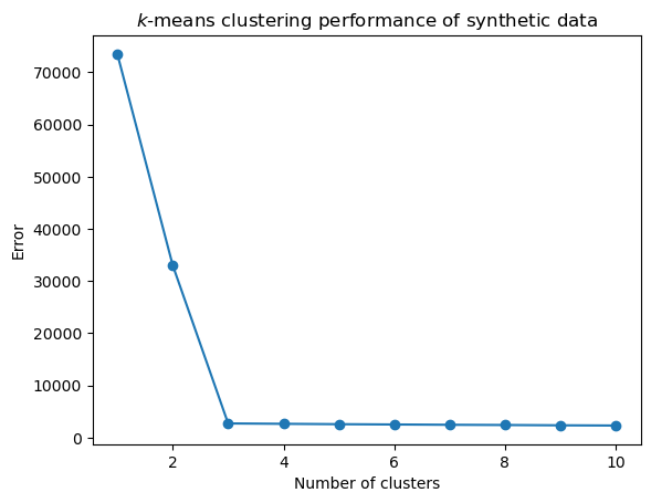
Warning: This synthetic data is not at all typical. You will almost never see such a sharp change in the error function as we see here.
Let’s create a function for later use.
Show code cell source
def evaluate_clusters(X,max_clusters):
    error = np.zeros(max_clusters+1)
    error[0] = 0;
    for k in range(1,max_clusters+1):
        kmeans = KMeans(init='k-means++', n_clusters=k, n_init=10)
        kmeans.fit_predict(X)
        error[k] = kmeans.inertia_
    return error
Silhouette Coefficient#
Of course, normally, the ground truth labels are not known.
In that case, evaluation must be performed using the model itself. |
Recall our definition of clustering:
a grouping of data objects, such that the objects within a group are similar (or near) to one another and dissimilar (or far) from the objects in other groups.
This suggests a metric that could evaluate a clustering: comparing the distances between points within a cluster, to the distances between points in different clusters.
The Silhouette Coefficient is an example of such an evaluation, where a higher Silhouette Coefficient score relates to a model with “better defined” clusters.
(sklearn.metrics.silhouette_score)
Let \(a\) be the mean distance between a data point and all other points in the same cluster.
Let \(b\) be the mean distance between a data point and all other points in the next nearest cluster.
Then the Silhouette Coefficient for a clustering is: $\(s = \frac{b-a}{\max(a, b)}\)$
sc = metrics.silhouette_score(X, labels, metric='euclidean')
print(sc)
0.8319348841402534
Show code cell source
def sc_evaluate_clusters(X, max_clusters, n_init, seed):
    s = np.zeros(max_clusters+1)
    s[0] = 0;
    s[1] = 0;
    for k in range(2, max_clusters+1):
        kmeans = KMeans(init='k-means++', n_clusters = k, n_init = n_init, random_state = seed)
        kmeans.fit_predict(X)
        s[k] = metrics.silhouette_score(X, kmeans.labels_, metric = 'euclidean')
    return s

s = sc_evaluate_clusters(X, 10, 10, 1)
plt.plot(range(2, len(s)), s[2:], 'o-')
plt.xlabel('Number of Clusters')
plt.title('$k$-means clustering performance on synthetic data')
plt.ylabel('Silhouette Score');
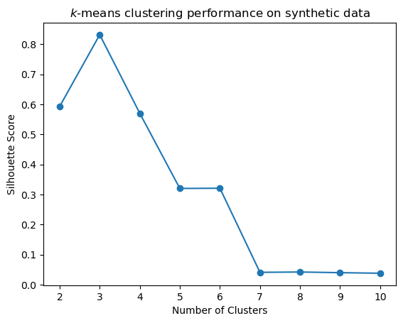
Again, these results are more perfect than typical.
But the general idea is to look for a local maximum in the Silhouette Coefficient as the potential number of clusters.
Taking the Training Wheels Off: Real Data#
As a “real world” example, we’ll use the “20 Newsgroup” data provided as example data in sklearn.
(http://scikit-learn.org/stable/datasets/twenty_newsgroups.html).
from sklearn.datasets import fetch_20newsgroups

"""
categories = [
 'comp.windows.x',
 'misc.forsale',
 'rec.autos',
 'rec.motorcycles',
 'rec.sport.baseball',
 'rec.sport.hockey',
 'talk.religion.misc',
 'comp.graphics',
 'sci.space',
 'rec.autos',
 'rec.sport.baseball'
]
"""
categories = ['comp.os.ms-windows.misc', 'sci.space', 'rec.sport.baseball']
news_data = fetch_20newsgroups(subset = 'train', categories = categories)
print(news_data.target, len(news_data.target))
print(news_data.target_names)
[2 0 0 ... 2 1 2] 1781
['comp.os.ms-windows.misc', 'rec.sport.baseball', 'sci.space']
news_data.data[0]
'From: aws@iti.org (Allen W. Sherzer)\nSubject: Re: DC-X update???\nOrganization: Evil Geniuses for a Better Tomorrow\nLines: 122\n\nIn article <ugo62B8w165w@angus.mi.org> dragon@angus.mi.org writes:\n\n>Exactly when will the hover test be done, \n\nEarly to mid June.\n\n>and will any of the TV\n>networks carry it. I really want to see that...\n\nIf they think the public wants to see it they will carry it. Why not\nwrite them and ask? You can reach them at:\n\n\n F: NATIONAL NEWS MEDIA\n\n\nABC "World News Tonight" "Face the Nation"\n7 West 66th Street CBS News\nNew York, NY 10023 2020 M Street, NW\n212/887-4040 Washington, DC 20036\n 202/457-4321\n\nAssociated Press "Good Morning America"\n50 Rockefeller Plaza ABC News\nNew York, NY 10020 1965 Broadway\nNational Desk (212/621-1600) New York, NY 10023\nForeign Desk (212/621-1663) 212/496-4800\nWashington Bureau (202/828-6400)\n Larry King Live TV\n"CBS Evening News" CNN\n524 W. 57th Street 111 Massachusetts Avenue, NW\nNew York, NY 10019 Washington, DC 20001\n212/975-3693 202/898-7900\n\n"CBS This Morning" Larry King Show--Radio\n524 W. 57th Street Mutual Broadcasting\nNew York, NY 10019 1755 So. Jefferson Davis Highway\n212/975-2824 Arlington, VA 22202\n 703/685-2175\n"Christian Science Monitor"\nCSM Publishing Society "Los Angeles Times"\nOne Norway Street Times-Mirror Square\nBoston, MA 02115 Los Angeles, CA 90053\n800/225-7090 800/528-4637\n\nCNN "MacNeil/Lehrer NewsHour"\nOne CNN Center P.O. Box 2626\nBox 105366 Washington, DC 20013\nAtlanta, GA 30348 703/998-2870\n404/827-1500\n "MacNeil/Lehrer NewsHour"\nCNN WNET-TV\nWashington Bureau 356 W. 58th Street\n111 Massachusetts Avenue, NW New York, NY 10019\nWashington, DC 20001 212/560-3113\n202/898-7900\n\n"Crossfire" NBC News\nCNN 4001 Nebraska Avenue, NW\n111 Massachusetts Avenue, NW Washington, DC 20036\nWashington, DC 20001 202/885-4200\n202/898-7951 202/362-2009 (fax)\n\n"Morning Edition/All Things Considered" \nNational Public Radio \n2025 M Street, NW \nWashington, DC 20036 \n202/822-2000 \n\nUnited Press International\n1400 Eye Street, NW\nWashington, DC 20006\n202/898-8000\n\n"New York Times" "U.S. News & World Report"\n229 W. 43rd Street 2400 N Street, NW\nNew York, NY 10036 Washington, DC 20037\n212/556-1234 202/955-2000\n212/556-7415\n\n"New York Times" "USA Today"\nWashington Bureau 1000 Wilson Boulevard\n1627 Eye Street, NW, 7th Floor Arlington, VA 22229\nWashington, DC 20006 703/276-3400\n202/862-0300\n\n"Newsweek" "Wall Street Journal"\n444 Madison Avenue 200 Liberty Street\nNew York, NY 10022 New York, NY 10281\n212/350-4000 212/416-2000\n\n"Nightline" "Washington Post"\nABC News 1150 15th Street, NW\n47 W. 66th Street Washington, DC 20071\nNew York, NY 10023 202/344-6000\n212/887-4995\n\n"Nightline" "Washington Week In Review"\nTed Koppel WETA-TV\nABC News P.O. Box 2626\n1717 DeSales, NW Washington, DC 20013\nWashington, DC 20036 703/998-2626\n202/887-7364\n\n"This Week With David Brinkley"\nABC News\n1717 DeSales, NW\nWashington, DC 20036\n202/887-7777\n\n"Time" magazine\nTime Warner, Inc.\nTime & Life Building\nRockefeller Center\nNew York, NY 10020\n212/522-1212\n\n-- \n+---------------------------------------------------------------------------+\n| Lady Astor: "Sir, if you were my husband I would poison your coffee!" |\n| W. Churchill: "Madam, if you were my wife, I would drink it." |\n+----------------------57 DAYS TO FIRST FLIGHT OF DCX-----------------------+\n'
Feature Extraction#
We’ve discussed a bit the challenges of feature engineering.
One of the most basic issues concerns how to encode categorical or text data in a form usable by algorithms that expect numeric input.
The starting point is to note that one can encode a set using a binary vector with one component for each potential set member.
The so-called bag of words encoding for a document is to treat the document as a multiset of words.
That is, we simply count how many times each word occurs. It is a “bag” because all the order of the words in the document is lost.
Surprisingly, we can still tell a lot about the document even without knowing its word ordering.
Counting the number of times each word occurs in a document yields a vector of term frequencies.
However, simply using the “bag of words” directly has a number of drawbacks. First of all, large documents will have more words than small documents.
Hence it often makes sense to normalize the frequency vectors.
\(\ell_1\) or \(\ell_2\) normalization are common.
Next, as noted in scikit-learn:
In a large text corpus, some words will be very [frequent] (e.g. “the”, “a”, “is” in English) hence carrying very little meaningful information about the actual contents of the document.
If we were to feed the direct count data directly to a classifier those very frequent terms would shadow the frequencies of rarer yet more interesting terms.
In order to re-weight the count features into floating point values suitable for usage by a classifier it is very common to use the tf–idf transform.
Tf means term-frequency while tf–idf means term-frequency times inverse document-frequency.
This is a originally a term weighting scheme developed for information retrieval (as a ranking function for search engines results), that has also found good use in document classification and clustering.
The idea is that rare words are more informative than common words.
(This has connections to information theory).
Hence, the definition of tf-idf is as follows.
First:
Next, if \(N\) is the total number of documents in the corpus \(D\) then:
where the denominator is the number of documents in which the term \(t\) appears.
And finally:
from sklearn.feature_extraction.text import TfidfVectorizer
vectorizer = TfidfVectorizer(stop_words = 'english', min_df = 4, max_df = 0.8)
data = vectorizer.fit_transform(news_data.data)
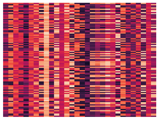
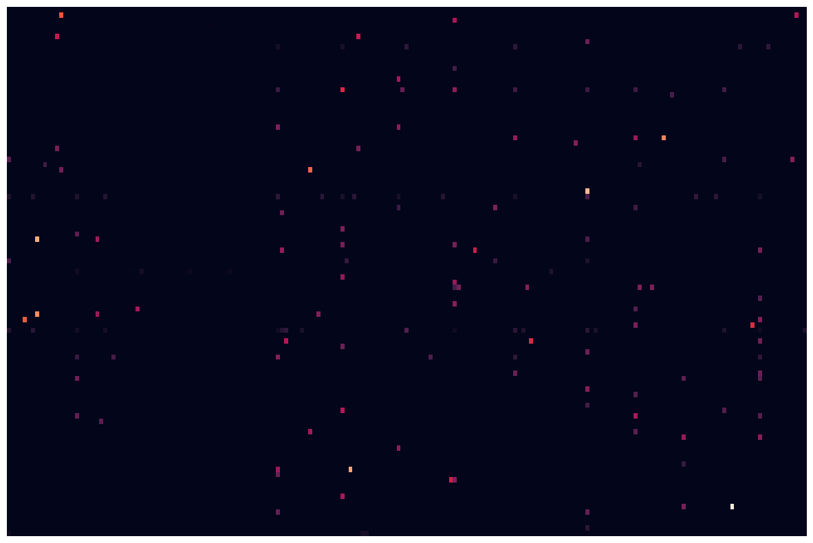
Getting to know the Data#
print(type(data), data.shape)
<class 'scipy.sparse._csr.csr_matrix'> (1781, 9409)
Show code cell source
fig, ax1 = plt.subplots(1,1,figsize=(15,10))
dum = sns.heatmap(data[1:100,1:200].todense(), xticklabels=False, yticklabels=False,
            linewidths=0, cbar=False, ax=ax1)
print(news_data.target)
print(news_data.target_names)
[2 0 0 ... 2 1 2]
['comp.os.ms-windows.misc', 'rec.sport.baseball', 'sci.space']
Selecting the Number of Clusters#
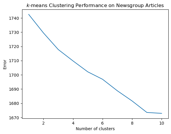
Show code cell source
error = evaluate_clusters(data, 10)
plt.plot(range(1, len(error)), error[1:])
plt.title('$k$-means Clustering Performance on Newsgroup Articles')
plt.xlabel('Number of clusters')
plt.ylabel('Error');
Show code cell source
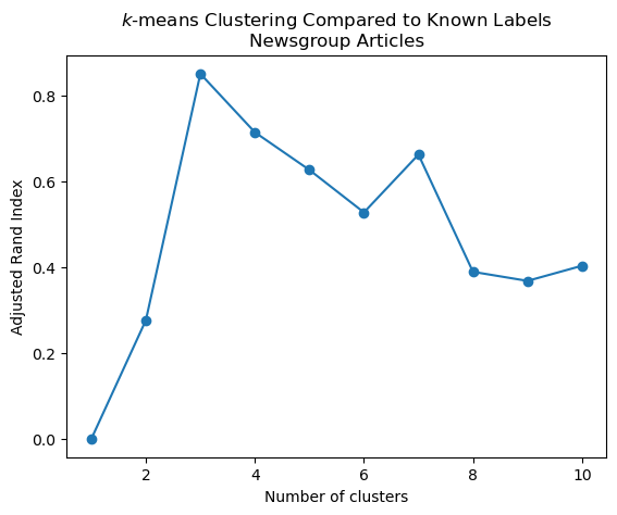
ri = ri_evaluate_clusters(data, 10, news_data.target)
plt.plot(range(1, len(ri)), ri[1:], 'o-')
plt.xlabel('Number of clusters')
plt.title('$k$-means Clustering Compared to Known Labels\nNewsgroup Articles')
plt.ylabel('Adjusted Rand Index');
Show code cell source
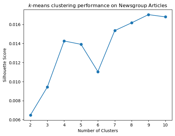
s = sc_evaluate_clusters(data, 10, 100, 3)
plt.plot(range(2, len(s)), s[2:], 'o-')
plt.xlabel('Number of Clusters')
plt.title('$k$-means clustering performance on Newsgroup Articles')
plt.ylabel('Silhouette Score');
Looking into the clusters#
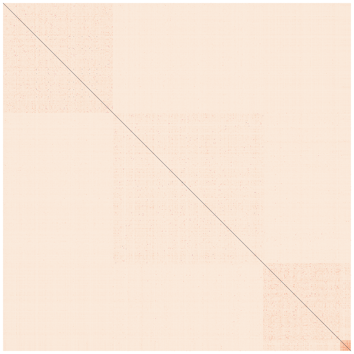
k = 4
kmeans = KMeans(n_clusters = k, init = 'k-means++', max_iter = 100, n_init = 25, random_state = 3)
kmeans.fit_predict(data)
array([1, 1, 1, ..., 3, 0, 2], dtype=int32)
print('Top terms per cluster:')
asc_order_centroids = kmeans.cluster_centers_.argsort()#[:, ::-1]
order_centroids = asc_order_centroids[:,::-1]
terms = vectorizer.get_feature_names_out()
for i in range(k):
    print(f'Cluster {i}:')
    for ind in order_centroids[i, :10]:
        print(f' {terms[ind]}')
    print('')
Top terms per cluster:
Cluster 0:
 edu
 baseball
 year
 team
 game
 com
 article
 players
 writes
 games

Cluster 1:
 windows
 edu
 com
 file
 dos
 university
 thanks
 ca
 files
 use

Cluster 2:
 space
 nasa
 access
 gov
 edu
 alaska
 digex
 com
 pat
 moon

Cluster 3:
 henry
 toronto
 zoo
 spencer
 zoology
 edu
 work
 utzoo
 kipling
 umd
Show code cell source
euclidean_dists = metrics.euclidean_distances(data)
labels = kmeans.labels_
idx = np.argsort(labels)
clustered_dists = euclidean_dists[idx][:,idx]
fig, ax1 = plt.subplots(1,1,figsize=(15,15))
dum = sns.heatmap(clustered_dists, xticklabels=False, yticklabels=False, linewidths=0, square=True,cbar=False, ax=ax1)
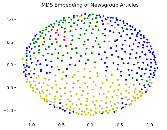
Let’s visualize with MDS. Note that MDS is a slow algorithm and we can’t do all 1700+ data points quickly, so we will take a random sample.
Show code cell source
import random
n_items = euclidean_dists.shape[0]
subset = random.sample(range(n_items),500)

fit = mds.fit(euclidean_dists[subset][:,subset])
pos = fit.embedding_
/Users/crovella/miniconda3/lib/python3.9/site-packages/sklearn/manifold/_mds.py:299: FutureWarning: The default value of `normalized_stress` will change to `'auto'` in version 1.4. To suppress this warning, manually set the value of `normalized_stress`.
  warnings.warn(
labels
array([1, 1, 1, ..., 3, 0, 2], dtype=int32)
Show code cell source
cols = [['y', 'b', 'g', 'r', 'c'][l] for l in labels[subset]]
plt.scatter(pos[:, 0], pos[:, 1], s = 12, c = cols)
plt.title('MDS Embedding of Newsgroup Articles');