Show code cell content
%matplotlib inline
%config InlineBackend.figure_format='retina'
import numpy as np
import pandas as pd
import matplotlib.pyplot as plt
import seaborn as sns
from IPython.display import Image, display_html, display, Math, HTML;
Probability and Statistics Refresher#
Today we’ll review the essentials of probability and statistics that we’ll need for this course.
Probability#
What is probability?
We all have a general sense of what is meant by probability.
However, when we look closely, we see that there are at least two different ways to interpret the notion of “the probability of an event.”
The first view is summarized by this quote from the first pages of a probability textbook:
Suppose an experiment under consideration can be repeated any number of times, so that, in principle at least, we can produce a whole series of “independent trials under identical conditions” in each of which, depending on chance, a particular event \(A\) of interest either occurs or does not occur.
Let \(n\) be the total number of experiments in the whole series of trials, and let \(n(A)\) be the number of experiement in which \(A\) occurs. Then the ratio \(n(A)/n\) is called the relative frequency of the event \(A.\)
It turns out that the relative frequencies observed in different series of trials are virtually the same for large \(n,\) clustering about some constant \(P[A],\) which is called the probability of the event \(A.\)
Y. A. Rozanov. Probability Theory: A Concise Course. Dover Publications, Inc., 1969.
This is called the frequentist intepretation of probability.
You can think of it as treating each event as a sort of idealized coin-flip.
The key idea in the above definition is to be able to:
produce a whole series of “independent trials under identical conditions”
However, we often use probability in another setting.
On a visit to the doctor, we may ask, “What is the probability that I have disease X?”
Or, before digging a well, we may ask, “What is the probability that I will strike water?”
These questions are totally incompatible with the notion of “independent trials under identical conditions”!
Rather, it seems that we are really asking:
“How certain should I be that I have disease X?”
“How certain should I be that I will strike water?”
In this setting, we are using probability to encode “degree of belief” or a “state of knowledge.”
This is called the Bayesian interpretation of probability.
Somewhat amazingly, it turns out that whichever way we think of probability (frequentist or Bayesian),
… the rules that we use for computing probabilities should be exactly the same.
In most cases in this course we will use frequentist language and examples when talking about probability.
But in point of fact, it’s often really a “state of knowledge” that we are really talking about when we use probability models in this course.
A thing appears random only through the incompleteness of our knowledge
– Spinoza
In other words, we use probability as an abstraction that hides details we don’t want to deal with.
(This is a time-honored use of probability.)
So it’s important to recognize that both frequentist and Bayesian views are valid and useful views of probability.

So, now, let’s talk about rules for computing probabilities.
Probability and Conditioning#
Definition. Consider a set \(\Omega\), referred to as the sample space. A probability measure on \(\Omega\) is a function \(P[\cdot]\) defined on all the subsets of \(\Omega\) (the events) such that:
\(P[\Omega] = 1\)
For any event \(A \subset \Omega\), \(P[A] \geq 0.\)
For any events \(A, B \subset \Omega\) where \(A \cap B = \emptyset\), \(P[A \cup B] = P[A] + P[B]\).
Often we want to ask how a probability measure changes if we restrict the sample space to be some subset of \(\Omega\).
This is called conditioning.
Definition. The conditional probability of an event \(A\) given that event \(B\) (having positive probability) is known to occur, is
The function \(P[\cdot|B]\) is a probability measure over the sample space \(B\).
Note that in the expression \(P[A|B]\), \(A\) is random but \(B\) is fixed.
Now if \(B\) is a proper subset of \(\Omega,\) then \(P[B] < 1\). So \(P[\cdot|B]\) is a rescaling of the quantity \(P[A\cap B]\) so that \(P[B|B] = 1.\)
The sample space \(\Omega\) may be continuous or discrete, and bounded or unbounded.
Independent Events.
Definition. Two events \(A\) and \(B\) are independent if \(P[A\cap B] = P[A] \cdot P[B].\)
This is exactly the same as saying that \(P[A|B] = P[A].\)
So we can see that the intuitive notion of independence is that “if one event occurs, that does not change the probability of the other event.”
Random Variables#
We are usually interested in numeric values associated with events.
When a random event has a numeric value we refer to it as a random variable.
Notationally, we use CAPITAL LETTERS for random variables and lowercase for non-random quantities.
To collect information about what values of the random variable are more probable than others, we have some more definitions.
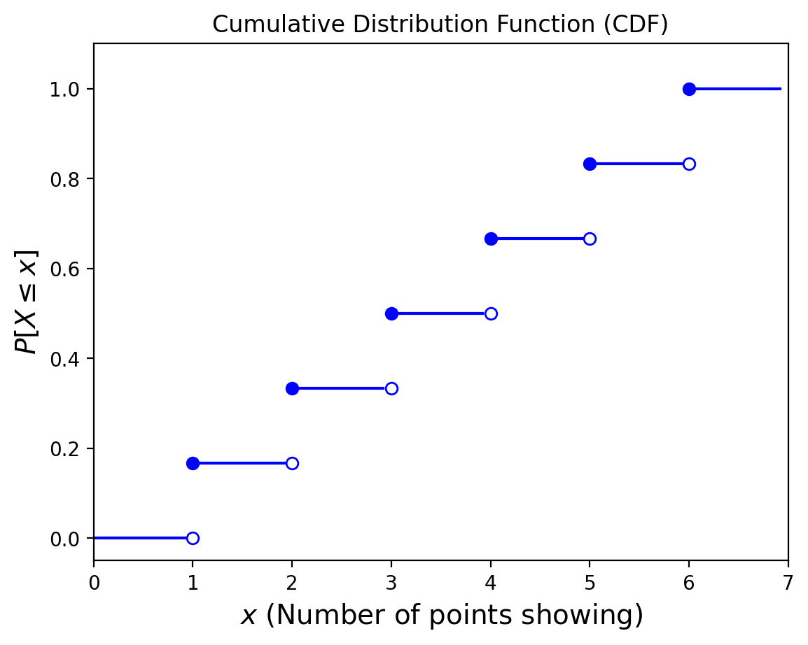
Definition. The cumulative distribution function (CDF) F for a random variable \(X\) is equal to the probability measure for the event that consists of all possible outcomes with a value of the random variable \(X\) less than or equal to \(x\), that is, \(F(x) = P[X \leq x].\)
Example. Consider the roll of a single die. The random variable here is the number of points showing. What is the CDF?

Show code cell source
plt.figure()
for i in range(7):
    plt.plot([i, i+1-.08], [i/6, i/6],'-b')
for i in range(1, 7):
    plt.plot(i, i/6, 'ob')
    plt.plot(i, (i-1)/6, 'ob', fillstyle = 'none')
plt.xlim([0, 7])
plt.ylim([-0.05, 1.1])
plt.title('Cumulative Distribution Function (CDF)')
plt.xlabel(r'$x$ (Number of points showing)', size=14)
plt.ylabel(r'$P[X\leq x]$', size=14);
Now, consider this CDF of some random variable:
Show code cell source
from scipy.stats import norm
plt.figure()
x = np.linspace(norm.ppf(0.001), norm.ppf(0.999), 100)
plt.plot(x, norm.cdf(x),'b-', lw=5, alpha = 0.6)
plt.title('Cumulative Distribution Function (CDF)')
plt.xlabel(r'$x$', size=14)
plt.ylabel(r'$P[X\leq x]$', size=14);
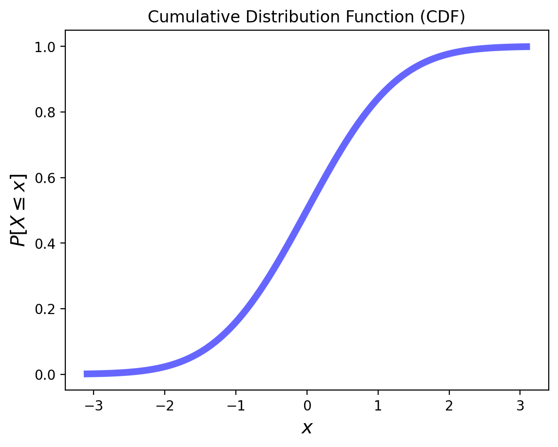
What does it mean when the slope is steeper for some \(x\) values?
The slope tells us how likely values are in a particular range.
This is important enough that we define a function to capture it.
Definition. The probability density function (pdf) is the derivative of the CDF, when that is defined.
Often we will go the other way as well:
You should be able to see that:
and
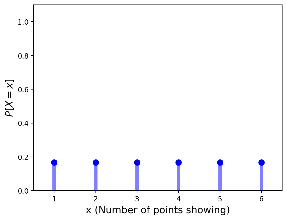
Now, for a discrete random variable, the CDF is not differentiable (because the CDF is a step function).
For the PDF of discrete RVs, we simply plot the probability function of each value. That is, we plot \(P[X = x]\) for the various values of \(x\).
Another way to think of the PDF is that it consists of impulses at the points of discontinuity of the CDF.
For our example of the single die:
Show code cell source
plt.figure()
x = np.arange(1, 7)
plt.plot(x, 6*[1/6.], 'bo', ms=8)
plt.vlines(x, 0, 1/6., colors='b', lw=5, alpha=0.5)
plt.xlim([0.5, 6.5])
plt.ylim([0, 1.1])
plt.xlabel(r'x (Number of points showing)', size=14)
plt.ylabel(r'$P[X = x]$', size=14);
Characterizing Random Variables#
Definition. The expected value \(E[X]\) of a random variable \(X\) is the probability-weighted sum or integral of all possible values of the R.V.
For a discrete random variable, this is:
and for a continuous random variable with pdf \(p():\)
The expected value is also called the average or the mean, although we prefer to reserve those terms for empirical statistics (actual measurements, not idealizations like these formulas).
The expected value is in some sense the “center of mass” of the random variable. It is often denoted \(\mu\).
The mean is usually a quite useful characterization of the random variable.
However, be careful: in some cases, the mean may not be very informative, or important.
In some cases a random variable may not ever take on the mean as a possible value. (Consider again the single die, whose mean is 3.5)
In other cases the notion of average isn’t useful, as for the person with their head in the oven and feet in the freezer who claims “on average I feel fine.”
In other words, the mean may not be very informative when observations are highly variable.
In fact, the variability of random quantities is crucially important to characterize.
For this we use variance, the mean squared difference of the random variable from its mean.
Definition. The variance of a random variable \(X\) is
For example, given a discrete R.V. with \(E[X] = \mu\) this would be:
We use the symbol \(\sigma^2\) to denote variance.
The units of variance are the square of the units of the mean.
So to compare variance and mean in the same units, we take the square root of the variance.
This is called the standard deviation and is denoted \(\sigma\).
Next, let’s recall the case of the Tesla and Yelp returns from the last lecture:
Show code cell source
import pandas as pd
import yfinance as yf

stocks = ['TSLA', 'YELP']
df = pd.DataFrame()
for s in stocks:
    df[s] = pd.DataFrame(yf.download(s,start='2014-01-01',end='2014-12-31', progress = False))['Close']

rets = df.pct_change(30)
rets[['TSLA', 'YELP']].plot(lw=2)
plt.legend(loc='best');
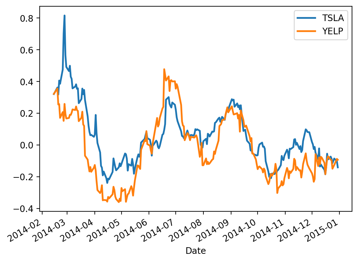
Treating these two timeseries as random variables, we are interested in how they vary together.
This is captured by the concept of covariance.
Definition. For two random variables \(X\) and \(Y\), their covariance is defined as:
If covariance is positive, this tells us that \(X\) and \(Y\) tend to be both above their means together, and both below their means together.
We will often denote \(\text{Cov}(X,Y)\) as \(\sigma_{XY}\)
If we are interested in asking “how similar” are two random variables, we want to normalize covariance by the amount of variance shown by the random variables.
The tool for this purpose is correlation, ie, normalized covariance:
\(\rho(X, Y)\) takes on values between -1 and 1.
If \(\rho(X, Y) = 0\) then \(X\) and \(Y\) are uncorrelated. Note that this is not the same thing as being independent!
\(\rho\) is sometimes called “Pearson \(r\)” after Karl Pearson who popularized it.
Let’s look at our example again:
Show code cell source
rets = df.pct_change(30)
rets[['TSLA', 'YELP']].plot(lw=2)
plt.legend(loc='best');
df.cov()
| TSLA | YELP | |
|---|---|---|
| TSLA | 3.830274 | 3.187969 |
| YELP | 3.187969 | 139.851859 |
In the case of Tesla (\(X\)) and Yelp (\(Y\)) above, we find that
Is that a big number? small number?
df.corr()
| TSLA | YELP | |
|---|---|---|
| TSLA | 1.000000 | 0.137742 |
| YELP | 0.137742 | 1.000000 |
So:
Apparently, not a big number!
Low and High Variability#
Historically, most sources of random variation that have concerned statisticians are instances of low variability.
The original roots of probability in the study of games of chance, and later in the study of biology and medicine, have mainly studied objects with low variability.
(Note that by “low variability” I don’t mean that such variability is unimportant.)
Some examples of random variation in this category are:
the heights of adult humans
the number of trees per unit area in a mature forest
the sum of 10 rolls of a die
the time between emission of subatomic particles from a radioactive material.
In each of these cases, there are a range of values that are “typical,” and there is a clear threshold above what is typical, that essentially never occurs.
On the other hand, there are some situations in which variability is quite different.
In these cases, there is no real “typical” range of values, and arbitrarily large values can occur with non-negligible frequency.
Some examples in this category are
the distribution of wealth among individuals in society
the sizes of human settlements
the areas burnt in forest fires
the runs of gains and losses in various financial markets over time
and the number of collaborators a scholar has over her lifetime.
The banking system (betting against rare events) just lost [more than] 1 Trillion dollars (so far) on a single error, more than was ever earned in the history of banking.
Nassim Nicholas Taleb, September 2008
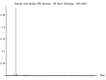
An example of a run of observations showing high variability. This figure shows the daily variations in a derivatives portfolio over the timeframe 1988-2008. About 99% of the variation over the 20 years occurs in a single day (the day the European Monetary System collapsed).
Important Random Variables#
Now we will review certain random variables that come up over and over again in typical situations.
Independent Binary Trials#
Here is our canonical experiment: flipping a weighted coin.
The coin comes up “heads” (aka “success”) with probability \(p\).
We use the standard notation that the corresponding probability (“tails”, “failure”) is denoted \(q\) (i.e., \(q = 1-p\)).
These are called Bernoulli trials.
One can think of each trial as a timestep so these are about discrete time.
Notice that by definition, Bernoulli trials are independent events.
Now we will extend this notion to continuous time.
To start with, imagine that you flip the coin once per second.
So we expect to observe \(p\) successes per second.
Now, imagine that you “speed up” the coin flipping so that instead of flipping a coin once per second, you flip it \(m > 1\) times per second,
… and you simultaneously decrease the probability of success to \(p/m\).
Then you expect the same number of successes per second (i.e., \(p\)) … but events can happen at finer time intervals.
Now imagine the limit as \(m \rightarrow \infty\).
This is a mathematical abstraction in which
an event can happen at any time instant
an event at any time instant is equally likely
and an event at any time instant is independent of any other time instant (it’s still a coin with no memory).
In this setting, we can think of events happening at some rate \(\lambda\) that is equal to \(p\) per second.
Note that \(\lambda\) has units of inverse time, e.g., sec\(^{-1}\).
Thus we have defined two kinds of coin-flipping:
in discrete time (Bernoulli trials with success probability \(p\))
and in continuous time (with success rate \(\lambda\))
For each of these two cases (discrete and continuous time) there are two questions we can ask:
Given that an event has just occured, how long until the next success?
In a fixed number of trials or amount of time, how many events occur?
These four cases define four commonly-used random variables.
# Trials or Time Until Event |
Number of Events in Fixed Time |
|
|---|---|---|
Discrete Trials |
Geometric |
Binomial |
Continuous Rate |
Exponential |
Poisson |
Each one has an associated distribution.
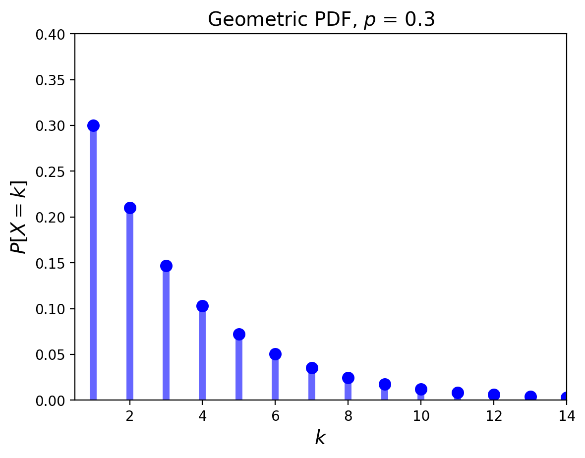
The Geometric Distribution#
The geometric distribution concerns Bernoulli trials.
It answers the question: “what is the probability it takes \(k\) trials to obtain the first success?”
Its PDF is given by:
Its mean is \(\mu = \frac{1}{p}\) and its variance is \(\sigma^2 = \frac{1-p}{p^2}\).
Its pdf looks like:
Show code cell source
from scipy.stats import geom
p = 0.3
x = np.arange(geom.ppf(0.01, p), geom.ppf(0.995, p))
plt.ylim([0, 0.4])
plt.xlim([0.5, max(x)])
plt.plot(x, geom.pmf(x, p), 'bo', ms=8, label = 'geom pmf')
plt.vlines(x, 0, geom.pmf(x, p), colors='b', lw = 5, alpha = 0.6)
plt.title(f'Geometric PDF, $p$ = {p}', size=14)
plt.xlabel(r'$k$', size=14)
plt.ylabel(r'$P[X = k]$', size=14);
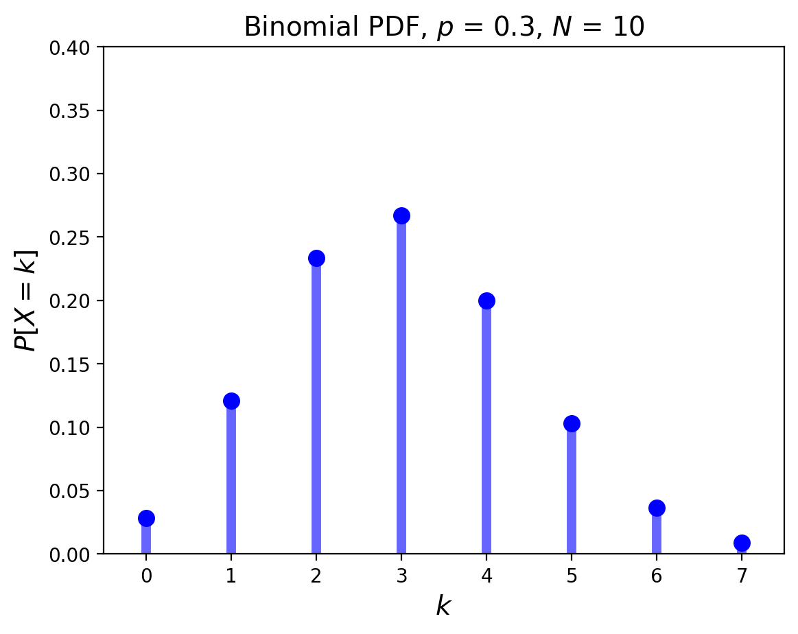
The Binomial Distribution#
The Binomial also concerns Bernoulli trials.
In this experiment there are precisely \(N\) coin flips, and \(p\) is still the probability of a success.
Now we ask: what is the probability there will be \(k\) successes?
For any given sequence of \(k\) successes and \(N-k\) failures, the probability is \(p^k \;(1-p)^{N-k}\).
But there are many different such sequences: \(\binom{N}{k}\) of them in fact.
So this distribution is \(P[X=k] = \binom{N}{k}\; p^k\; (1-p)^{N-k}.\)
Its mean is \(pN\), and its variance is \(pqN\).
Show code cell source
from scipy.stats import binom
p = 0.3
x = np.arange(binom.ppf(0.01, 10, p), binom.ppf(0.9995, 10, p))
plt.ylim([0, 0.4])
plt.xlim([-0.5, max(x)+0.5])
plt.plot(x, binom.pmf(x, 10, p), 'bo', ms=8, label = 'binom pmf')
plt.vlines(x, 0, binom.pmf(x, 10, p), colors='b', lw = 5, alpha=0.6)
plt.title(f'Binomial PDF, $p$ = {p}, $N$ = 10', size=14)
plt.xlabel(r'$k$', size=14)
plt.ylabel(r'$P[X = k]$', size=14);
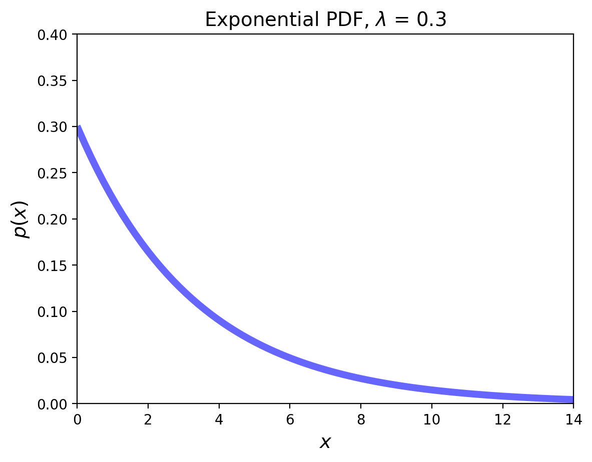
The Exponential Distribution#
Now we shift to a situation where successes occur at a fixed rate.
The Exponential random variable is the analog of the geometric in the continuous case, i.e., the situation in which a success happens at some rate \(\lambda\).
This RV can be thought of as measuring the time until a success occurs.
Its pdf is:
The mean is \(1/\lambda\), and the variance is \(1/\lambda^2\).
Show code cell source
from scipy.stats import expon
p = 0.3
x = np.linspace(expon.ppf(0.01, scale=1/p), expon.ppf(0.995, scale=1/p), 100)
plt.plot(x, expon.pdf(x, scale=1/p),'b-', lw = 5, alpha = 0.6, label='expon pdf')
plt.title(f'Exponential PDF, $\lambda$ = {p}', size=14)
plt.xlabel(r'$x$', size=14)
plt.ylabel(r'$p(x)$', size=14)
plt.ylim([0, 0.4])
plt.xlim([0, 14]);
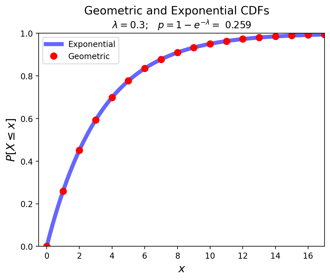
Notice how the Exponential is the continuous analog of the Geometric:
Show code cell source
from math import exp
lam = 0.3
p = 1 - exp(- lam)
x = np.linspace(expon.ppf(0, scale=1/lam), expon.ppf(0.995, scale=1/lam), 100)
plt.plot(x, expon.cdf(x, scale=1/lam),'b-', lw = 5, alpha = 0.6, label='Exponential')
xg = np.arange(geom.ppf(0, p), geom.ppf(0.995, p))
plt.ylim([0, 1])
plt.xlim([-0.5, max(xg)])
plt.plot(xg, geom.cdf(xg, p), 'ro', ms = 8, label = 'Geometric')
plt.suptitle(f'Geometric and Exponential CDFs', size = 14)
plt.title(r'$\lambda = 0.3; \;\;\; p = 1-e^{-\lambda} =$' + f' {p:0.3f}', size=12)
plt.xlabel(r'$x$', size=14)
plt.ylabel(r'$P[X \leq x]$', size = 14)
plt.legend(loc = 'best');
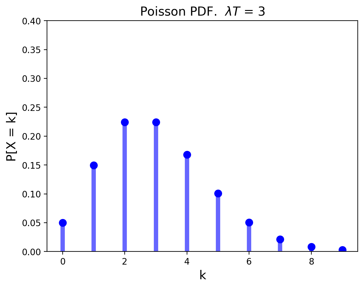
The Poisson Distribution#
When we ask the question
“How many successes occur in a fixed amount of time?”,
…we get the Poisson distribution.
The Poisson Distribution is the limiting form of binomial, when the number of trials goes to infinity, happening at some rate \(\lambda\).
It answers the question: when events happen indepdently at some fixed rate, how many will occur in a given fixed interval?
Its mean is \(\lambda T\) and its variance is \(\lambda T\) as well.
Show code cell source
from scipy.stats import poisson
mu = 3
x = np.arange(poisson.ppf(0.01, mu), poisson.ppf(0.9995, mu))
# plt.ylim([0,1])
plt.xlim([-0.5, max(x)+0.5])
plt.ylim(ymax = 0.4)
plt.plot(x, poisson.pmf(x, mu), 'bo', ms=8, label='poisson pmf')
plt.vlines(x, 0, poisson.pmf(x, mu), colors='b', lw=5, alpha=0.6)
plt.title(f'Poisson PDF.  $\lambda T$ = {mu}', size=14)
plt.xlabel(r'k', size=14)
plt.ylabel(r'P[X = k]', size=14);
The Poisson distribution has an interesting role in our perception of randomness (which you can read more about here).
The classic example comes from history. From the above site:
In 1898 Ladislaus Bortkiewicz, a Russian statistician of Polish descent, was trying to understand why, in some years, an unusually large number of soldiers in the Prussian army were dying due to horse-kicks. In a single army corp, there were sometimes 4 such deaths in a single year. Was this just coincidence?
To assess whether horse-kicks were random (not following any pattern) Bortkiewicz simply compared the number per year to what would be predicted by the Poisson distribution.
Show code cell source
# note that this data is available in 'data/HorseKicks.txt'
horse_kicks = pd.DataFrame(
data = np.array([
[0, 108.67, 109],
[1, 66.29, 65],
[2, 20.22, 22],
[3, 4.11, 3],
[4, 0.63, 1],
[5, 0.08, 0],
[6, 0.01, 0]]),
columns = ["Number of Deaths Per Year","Predicted Instances (Poisson)","Observed Instances"])
horse_kicks
| Number of Deaths Per Year | Predicted Instances (Poisson) | Observed Instances | |
|---|---|---|---|
| 0 | 0.0 | 108.67 | 109.0 |
| 1 | 1.0 | 66.29 | 65.0 |
| 2 | 2.0 | 20.22 | 22.0 |
| 3 | 3.0 | 4.11 | 3.0 |
| 4 | 4.0 | 0.63 | 1.0 |
| 5 | 5.0 | 0.08 | 0.0 |
| 6 | 6.0 | 0.01 | 0.0 |
Show code cell source
horse_kicks[["Predicted Instances (Poisson)","Observed Instances"]].plot.bar()
plt.xlabel("Number of Deaths Per Year", size=14)
plt.ylabel("Count", size=14);
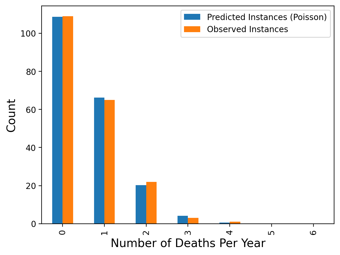
The message here is that when events occur at random, we actually tend to perceive them as clustered.
Here is another example:
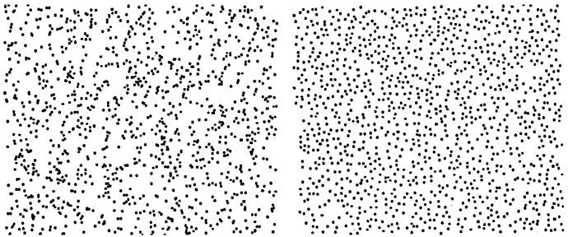
Which of these was generated by a random process ocurring equally likely everywhere?
These images are from Steven Pinker’s book, The Better Angels of our Nature.
In the left figure, the number of dots falling into regions of a given size follows the Poisson distribution.
The Uniform Distribution#
The uniform distribution models the case in which all outcomes are equally probable.
It can be a discrete or continuous distribution.
We have already seen the uniform distribution in the case of rolls of a fair die:
Show code cell source
plt.figure()
x = np.arange(1, 7)
plt.plot(x, 6*[1/6.], 'bo', ms=8)
plt.vlines(x, 0, 1/6., colors='b', lw=5, alpha=0.5)
plt.xlim([0.5, 6.5])
plt.ylim([0, 1.1])
plt.xlabel(r'x (Number of points showing)', size=14)
plt.ylabel(r'$P[X = x]$', size=14);
There is an important relationship between the uniform and Poisson distributions.
When the time an event occurs is uniformly distributed, the number of events in a time interval is Poisson distributed.
You can replace “time” with “location”, and so on.
Also, the reverse statment is true as well.
So a simple way to generate a picture like the scattered points above is to select the \(x\) and \(y\) coordinates of each point uniformly distributed over the picture size.
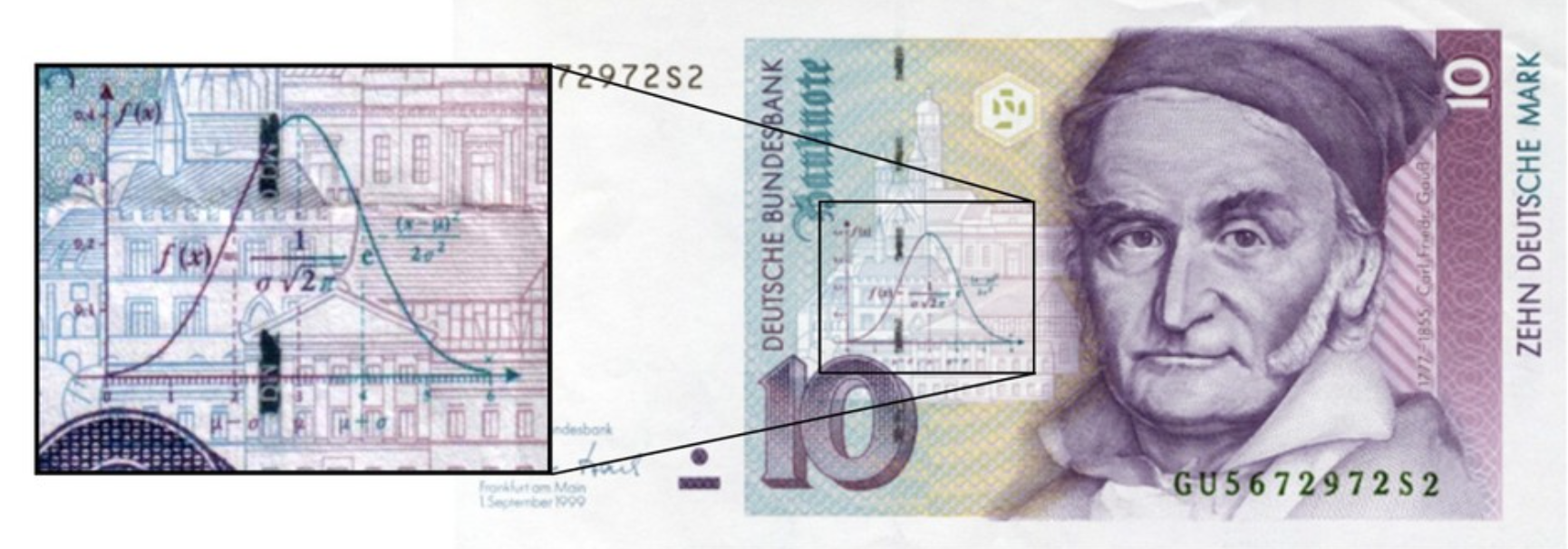
The Gaussian Distribution#
The Gaussian Distribution is also called the Normal Distribution.
We will make extensive use of Gaussian distribution, for a number of reasons.
One of reasons we will use it so much is that it is a good guess for how errors are distributed in data.
This comes from the celebrated Central Limit Theorem. Informally,
The sum of a large number of independent observations from any distribution with finite variance tends to have a Gaussian distribution.

Francis Galton's "Bean Machine"
As a special case, the sum of \(n\) independent Gaussian variates is Gaussian.
Thus Gaussian processes remain Gaussian after passing through linear systems.
If \(X_1\) and \(X_2\) are Gaussian, then \(X_3 = aX_1 + bX_2\) is Gaussian.
Thus we can see that one way of thinking of the Gaussian is that it is the limit of the Binomial when \(n\) is large, that is, the limit of the sum of many Bernoulli trials.
However many other sums of random variables (not just Bernoulli trials) converge to the Gaussian as well.
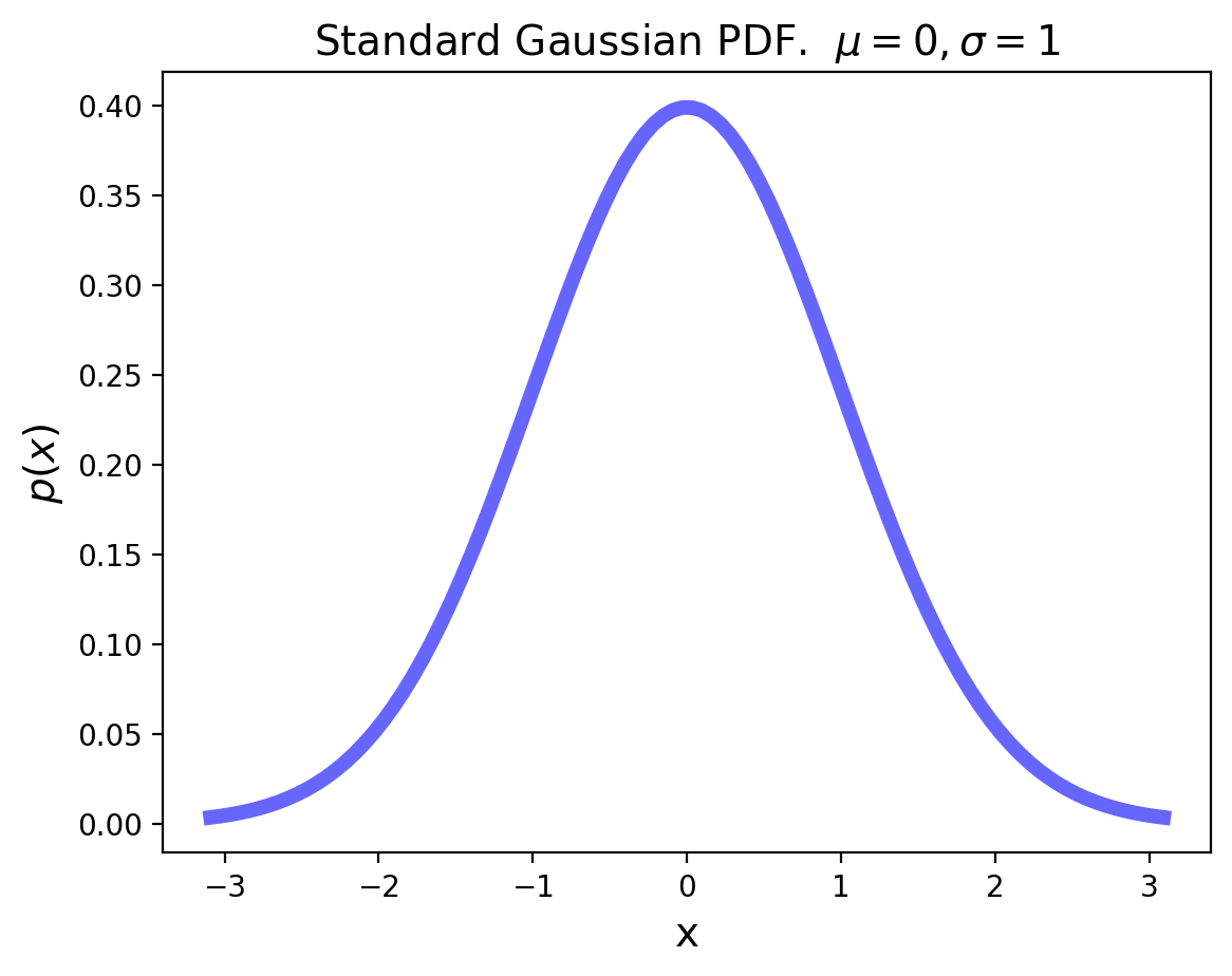
The standard Gaussian distribution has mean zero and a variance (and standard deviation) of 1. The pdf of the standard Gaussian is:
Show code cell source
from scipy.stats import norm
plt.figure()
x = np.linspace(norm.ppf(0.001), norm.ppf(0.999), 100)
plt.plot(x, norm.pdf(x),'b-', lw = 5, alpha = 0.6)
plt.title(r'Standard Gaussian PDF.  $\mu = 0, \sigma = 1$', size=14)
plt.xlabel('x', size=14)
plt.ylabel(r'$p(x)$', size=14);
Show code cell source
plt.figure()
x = np.linspace(norm.ppf(0.001), norm.ppf(0.999), 100)
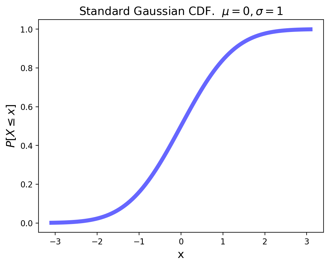
plt.plot(x, norm.cdf(x),'b-', lw = 5, alpha = 0.6)
plt.title(r'Standard Gaussian CDF. $\mu = 0, \sigma = 1$', size=14)
plt.xlabel('x', size=14)
plt.ylabel(r'$P[X\leq x]$', size=14);
For an arbitrary Gaussian distribution with mean \(\mu\) and variance \(\sigma^2\), the pdf is simply the standard Gaussian that is relocated to have its center at \(\mu\) and its width scaled by \(\sigma\):
Heavy Tails#
Earlier we discussed high- and low-variability.
All of the distributions we have discussed so far have “light tails”, meaning that they show low variability.
In other words, extremely large observations are essentially impossible.
However in other cases, extremely large observations can occur. Distributions that capture this property are called “heavy tailed”.
Some examples of data that can be often modeled using heavy-tailed distributions:
The sizes of files in a file system
The sizes of objects transferred over the Internet
The execution time of jobs on a computer system
The degree of nodes in a network (eg, social network).
In practice, random variables that follow heavy tailed distributions are characterized as exhibiting many small observations mixed in with a few large observations.
In such datasets, most of the observations are small, but most of the contribution to the sample mean or variance comes from the rare, large observations.
The Pareto Distribution#
The Pareto distribution is the simplest continuous heavy-tailed distribution.
Pareto was an Italian economist who studied income distributions. (In fact, income distributions typically show heavy tails.)
Its pdf is:
It takes on values in the range \([k, \infty]\).
Show code cell source
from scipy.stats import pareto
alpha = 1.3
x = np.linspace(pareto.ppf(0.005,alpha), pareto.ppf(0.995,alpha), 100)
plt.plot(x, pareto.pdf(x,alpha),'b-', lw = 5, alpha = 0.6, label='pareto pdf')
plt.title(r'Pareto PDF.  $\alpha$ = {}'.format(alpha), size=14)
plt.xlabel(r'x', size=14)
plt.ylabel(r'p(x)', size=14);
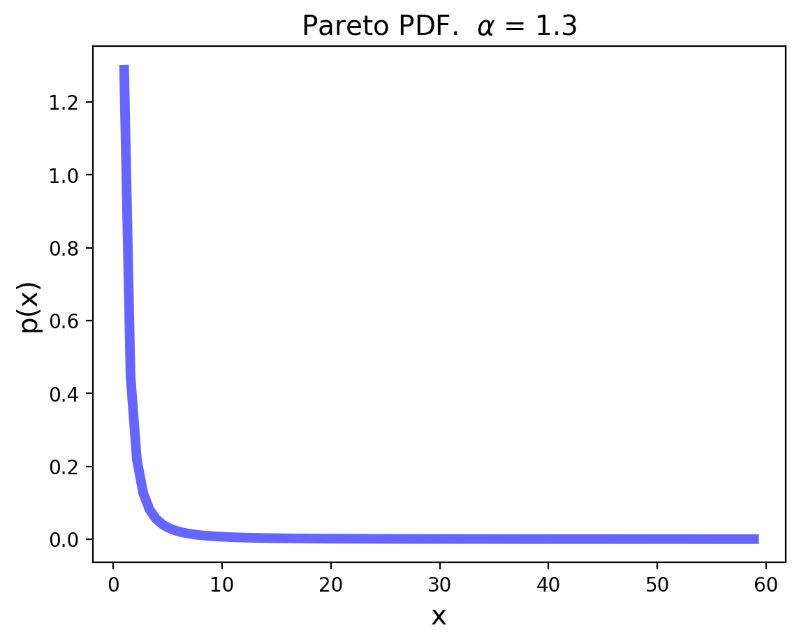
The variance of the Pareto distribution is infinite. (The corresponding integral diverges.)
In practice, this means that a new observation that significantly changes the sample variance is always possible, no matter how many samples of the random variable have already been taken.
The mean of the Pareto is \(\frac{k\alpha}{\alpha-1}\), for \(\alpha > 1\).
But note that as \(\alpha\) decreases, the variability of the Pareto increases.
In fact, for \(\alpha \leq 1\), the Pareto distribution has infinite mean. Again, in practice this means that a swamping observation for the mean is always possible.
Hence the running average of a series of Pareto observations with \(\alpha \leq 1\) will never converge to a fixed value, and the mean itself is not a useful statistic in this case.
Multivariate Random Variables#
A multivariate random variable is a vector of random variables.
We often simply say a “random vector”.
That is,
The expected value of a random vector is obtained by taking the expected value of each component random variable:
To properly characterize the variability of a random vector, we need to specify all the covariances of pairs of components.
We organize these values into a covariance matrix:
A couple things to note about a covariance matrix.
The covariance matrix is symmetric (because \(\text{Cov}(X_i, X_j) = \text{Cov}(X_j, X_i)\))
The covariance matrix is positive semidefinite.
Random Variables as Vectors#
When working with data, we will often treat multiple observations of some feature as samples of a random variable.
We will also typically organize the observations into a vector.
For example, consider our stock data:
df
| TSLA | YELP | |
|---|---|---|
| Date | ||
| 2014-01-02 | 10.006667 | 67.919998 |
| 2014-01-03 | 9.970667 | 67.660004 |
| 2014-01-06 | 9.800000 | 71.720001 |
| 2014-01-07 | 9.957333 | 72.660004 |
| 2014-01-08 | 10.085333 | 78.419998 |
| ... | ... | ... |
| 2014-12-23 | 14.731333 | 53.360001 |
| 2014-12-24 | 14.817333 | 53.000000 |
| 2014-12-26 | 15.188000 | 52.939999 |
| 2014-12-29 | 15.047333 | 53.009998 |
| 2014-12-30 | 14.815333 | 54.240002 |
251 rows × 2 columns
Each column can be treated as a vector.
So:
Let’s say that our data frame
dfis represented as a matrix \(D\),and that
df['TSLA']are observations of some random variable \(X\),and
df['YELP']are observations of some random variable \(Y\).
Let \(D\) have \(n\) rows (ie, \(n\) observations).
Now, let us subtract from each column its mean, to form a new matrix \(\tilde{D}\).
In the new matrix \(\tilde{D}\), every column has zero mean.
Then notice the following: the Covariance matrix of \((X, Y)\) is simply \(\frac{1}{n}\; \tilde{D}^T\tilde{D}\).
For example,
where \(\tilde{d}_1\) and \(\tilde{d}_2\) are the columns of \(\tilde{D}\).
This shows that covariance is actually an inner product between normalized observation vectors.
The Multivariate Gaussian#
The most common multivariate distribution we will work with is the multivariate Gaussian.
The multivariate normal distribution of a random vector \(\mathbf{X} = (X_1, \dots, X_k)^T\) is denoted:
where \(\mathbf{\mu} = E[\mathbf{X}] = (E[X_1], \dots, E[X_k])^T\)
and \(\Sigma\) is the \(k \times k\) covariance matrix where \(\Sigma_{i,j} = \text{Cov}(X_i, X_j)\).
Here are some examples.
We’ll consider two-component random vectors:
And our first example will be a simple one:
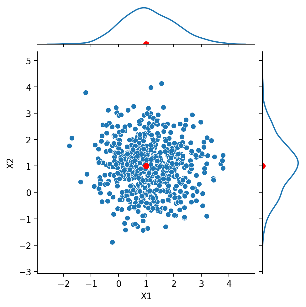
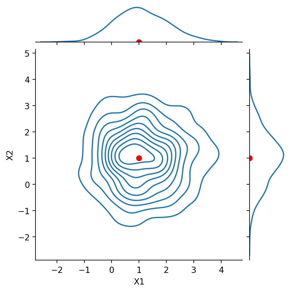
We see that the variance (and standard deviation) of each component is 1.
However the covariances are zero – the components are uncorrelated.
We will take 600 samples from this distribution.
Show code cell content
from scipy.stats import multivariate_normal
np.random.seed(4)
df1 = pd.DataFrame(multivariate_normal.rvs(mean = np.array([1, 1]), cov = np.eye(2), size = 600),
                  columns = ['X1', 'X2'])
Show code cell source
g = sns.JointGrid(data = df1, x = 'X1', y = 'X2', height = 5)
g.plot(sns.scatterplot, sns.kdeplot)
g.ax_joint.plot(1, 1, 'ro', markersize = 6)
g.ax_marg_x.plot(1, 0, 'ro')
g.ax_marg_y.plot(0, 1, 'ro');
Show code cell source
g = sns.JointGrid(data = df1, x = 'X1', y = 'X2', height = 5)
g.plot(sns.kdeplot, sns.kdeplot)
g.ax_joint.plot(1, 1, 'ro', markersize = 6)
g.ax_marg_x.plot(1, 0, 'ro')
g.ax_marg_y.plot(0, 1, 'ro');
Show code cell content
np.random.seed(4)
df1 = pd.DataFrame(multivariate_normal.rvs(mean = np.array([1, 1]), cov = np.array([[1, 0.8],[0.8, 1]]),
                                           size = 600),
                  columns = ['X1', 'X2'])
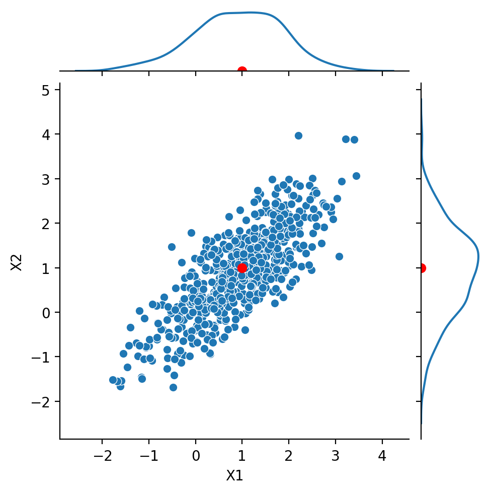
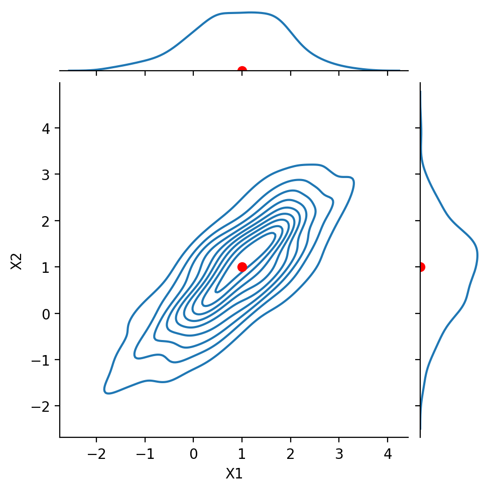
Next, we look at the case:
Notice that \(\text{Cov}(X_1, X_2) = 0.8\).
We say that the components are positively correlated.
Nonetheless, the marginals are still Gaussian.
Show code cell source
g = sns.JointGrid(data = df1, x = 'X1', y = 'X2', height = 5)
g.plot(sns.scatterplot, sns.kdeplot)
g.ax_joint.plot(1, 1, 'ro', markersize = 6)
g.ax_marg_x.plot(1, 0, 'ro')
g.ax_marg_y.plot(0, 1, 'ro');
Show code cell source
g = sns.JointGrid(data = df1, x = 'X1', y = 'X2', height = 5)
g.plot(sns.kdeplot, sns.kdeplot)
g.ax_joint.plot(1, 1, 'ro', markersize = 6)
g.ax_marg_x.plot(1, 0, 'ro')
g.ax_marg_y.plot(0, 1, 'ro');
Show code cell content
np.random.seed(4)
df1 = pd.DataFrame(multivariate_normal.rvs(mean = np.array([1, 1]), cov = np.array([[1, -0.8],[-0.8, 1]]),
                                           size = 600),
                  columns = ['X1', 'X2'])
Next, we look at the case:
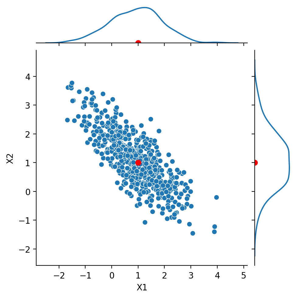
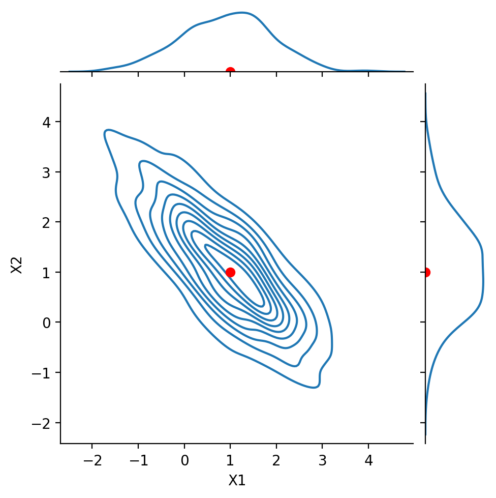
Notice that \(\text{Cov}(X_1, X_2) = -0.8\). We say that the components are negatively correlated or anticorrelated.
Show code cell source
g = sns.JointGrid(data = df1, x = 'X1', y = 'X2', height = 5)
g.plot(sns.scatterplot, sns.kdeplot)
g.ax_joint.plot(1, 1, 'ro', markersize = 6)
g.ax_marg_x.plot(1, 0, 'ro')
g.ax_marg_y.plot(0, 1, 'ro');
Show code cell source
g = sns.JointGrid(data = df1, x = 'X1', y = 'X2', height = 5)
g.plot(sns.kdeplot, sns.kdeplot)
g.ax_joint.plot(1, 1, 'ro', markersize = 6)
g.ax_marg_x.plot(1, 0, 'ro')
g.ax_marg_y.plot(0, 1, 'ro');
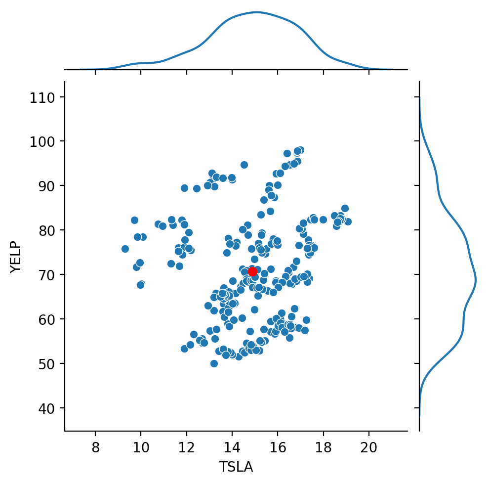
Finally, let’s look at our stock data:
Show code cell source
g = sns.JointGrid(data = df, x = 'TSLA', y = 'YELP', height = 5)
g.plot(sns.scatterplot, sns.kdeplot)
g.ax_joint.plot(df.mean()['TSLA'], df.mean()['YELP'], 'ro', markersize = 6);
Show code cell source
g = sns.JointGrid(data = df, x = 'TSLA', y = 'YELP', height = 5)
g.plot(sns.kdeplot, sns.kdeplot)
g.ax_joint.plot(df.mean()['TSLA'], df.mean()['YELP'], 'ro', markersize = 6);
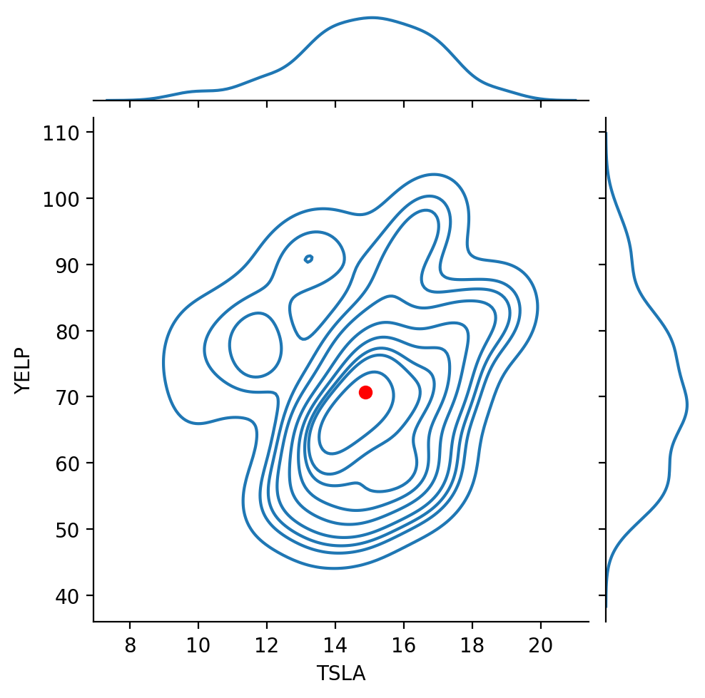
Recall that the correlation between these two stocks was about 0.137.
That is, the stocks are positively correlated, but not highly so.
Bayes’ Rule#
Bayes’ Rule is a simple way of manipulating conditional probabilities in a way that can be very useful.
Start with a situation in which we are interested in two events, \(A_1\) and \(A_2\).
These are exhaustive, meaning that in any experiment either \(A_1\) or \(A_2\) must occur. (That is, they form a partition of \(\Omega\).)
Now, according to the rules of probability:
(This is easy to extend to the case where \(A_1, A_2, ..., A_n\) form a partition of \(\Omega\).)
This formula is useful because often the probabilities \(P[B|A_i]\) can be estimated, while the probabilties \(P[A_i|B]\) may be hard to estimate.
Or perhaps \(P[B]\) itself (which is really the denominator) is easy to estimate.
We interpret this transformation as updating our estimate of the probability of each \(A_i\) based on new information, namely, that \(B\) is true.
This update transforms the prior probabilities \(P[A_i]\) into the posterior probabilities \(P[A_i|B]\).
Example.
Empirical evidence suggests that amongs sets of twins, about 1/3 are identical.
Assume therefore that probability of a pair of twins being identical to be 1/3.
Now, consider how a couple might update this probability after they get an ultrasound that shows that the twins are of the same gender.
What is their new estimate of the probability that their twins are identical?
Let \(I\) be the event that the twins are identical. Let \(G\) be the event that gender is the same via ultrasound.
The prior probabilities here is \(P[I]\).
What we want to calculate is the posterior probability \(P[I\,|\,G]\).
First, we note:
(Surprisingly, people are sometimes confused about that fact!)
Note that this conditional probability is easy to estimate.
Also, we assume that if the twins are not identical, they are like any two siblings, i.e., their probability of being same gender is 1/2:
Again, easy to estimate.
And we know from observing the population at large that among all sets of twins, about 1/3 are identical:
Note that this statistic is easy to obtain from data.
Then:
So we have updated our estimate of the twins being identical from 1/3 (prior probability) to 1/2 (posterior probability).
We did this in a way that used quantities that were relatively easy to obtain or measure.
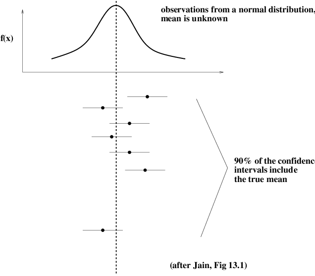
Confidence Intervals#
Say you are concerned with some data that we take as coming from a random process.
You want to characterize it as accurately as possible. You measure it, yielding a single value.
How much does that value tell you? Can you rely on it as a description of the random process?
Let’s say you have a dataset and you compute its average value.
How certain are you that the average would be the same if you took another dataset from the same source (i.e., the same random process)?
We think of the hypothetical data source as a random variable with a true mean \(\mu\).
(Note that we are using frequentist style thinking here.)
We would like to find a range within which we are 90% sure that the true mean \(\mu\) lies.
In other words, we want the probability that the true mean lies in the interval to be 0.9.
This interval is then called the 90% confidence interval.
To be more precise: A confidence interval at level \(\gamma\) for a fixed but unknown parameter \(m\) is an interval \((a,b)\) such that
Note that \(m\) is fixed — it is not random.
What is random is the interval \((A, B)\).
This interval is constructed based on the data, which (by assumption) are random.
Confidence Intervals for the Mean#
Imagine we have a set of \(n\) samples of a random variable, \(x_1, x_2, ..., x_n\) Let’s assume that the random variable has mean \(\mu\) and variance \(\sigma^2\).
An estimate of \(\mu\) is the empirical average of the samples, \(\bar{x}\).
Now, the Central Limit Theorem tells us that the sum of a large number \(n\) of random variables, each with mean \(\mu\) and variance \(\sigma^2\), yields a Gaussian random variable with mean \(n\mu\) and variance \(n \sigma^2\).
So the distribution of the average of \(n\) samples is normal with mean \(\mu\) and variance \(\sigma^2 / n\). That is,
We usually assume that the number of samples should be 30 or more for the CLT to hold.
While the specific value 30 is a bit arbitrary, we will usually be using very large samples (datasets) in this course for which this assumption is valid.
The standard deviation of the sample mean is called the standard error.
Notice that the standard error decreases as we increase the sample size, according to \(1/\sqrt{n}.\)
So it will turn out that using \(\bar{x}\), we can get increasingly “tight” estimates of \(\mu\) as we increase the number of samples \(n\).
Now, remember that the true mean \(\mu\) is a constant, while the empirical mean \(\bar{x}\) is a random variable.
Let us assume for a moment that we know the true \(\mu\) and \(\sigma\), and that we accept that \(\bar{x}\) has a \(N(\mu, \sigma/\sqrt{n})\) distribution.
Then it is true that
where \(S\) is the standard Gaussian random variable (having distribution \(N(0,1)\)).
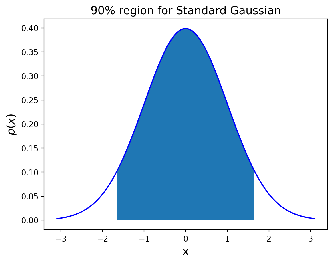
We write \(z_{1-\alpha/2}\) to be the \(1-\alpha/2\) quantile of the unit normal. That is,
So to form a 90% probability interval for \(S\) (centered on zero) we choose \(k = z_{0.95}\).
Show code cell source
from scipy.stats import norm
plt.figure()
x = np.linspace(norm.ppf(0.001), norm.ppf(0.999), 100)
x90 = np.linspace(norm.ppf(0.05), norm.ppf(0.95), 100)
plt.plot(x, norm.pdf(x),'b-')
plt.fill_between(x90, 0, norm.pdf(x90))
plt.title(r'90% region for Standard Gaussian', size = 14)
plt.xlabel('x', size = 14)
plt.ylabel(r'$p(x)$', size = 14);
Turning back to \(\bar{x}\), the 90% probability interval on \(\bar{x}\) would be:
The last step: by a simple argument, we can show that the sample mean is in some fixed-size interval centered on the true mean, if and only if the true mean is also in a fixed-size interval (of the same size) centered on the sample mean.
This means that:
This latter expression defines the \(1-\alpha\) confidence interval for the mean.
We are done, except for estimating \(\sigma\). We do this directly from the data: \(\hat{\sigma} = s\)
where \(s\) is the sample standard deviation, that is, \(s = \sqrt{1/(n-1) \sum (x_i - \bar{x})^2}\).
To summarize: by the argument presented here, a 100(1-\(\alpha\))% confidence interval for the population mean is given by
As an example, a 95% confidence interval for the mean is the sample average plus or minus two standard errors.